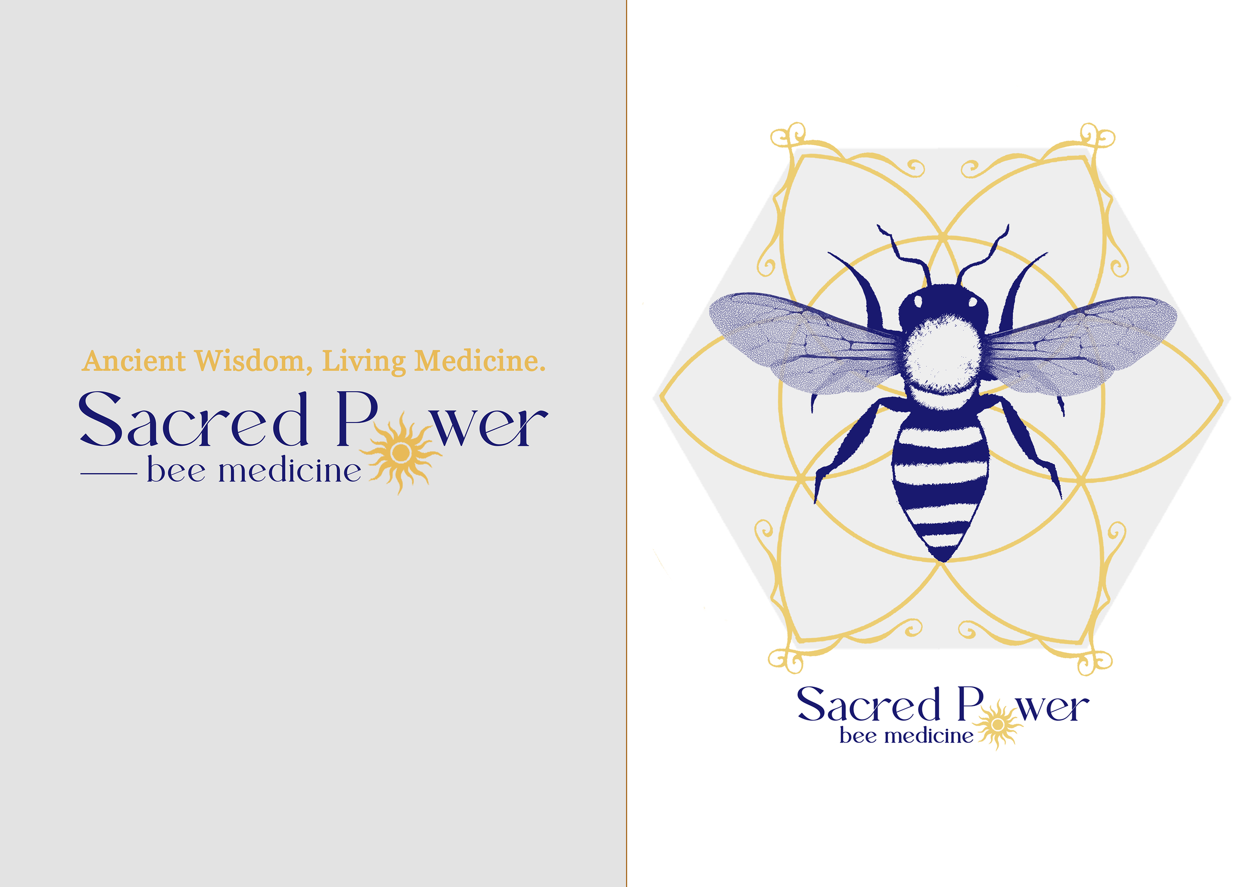
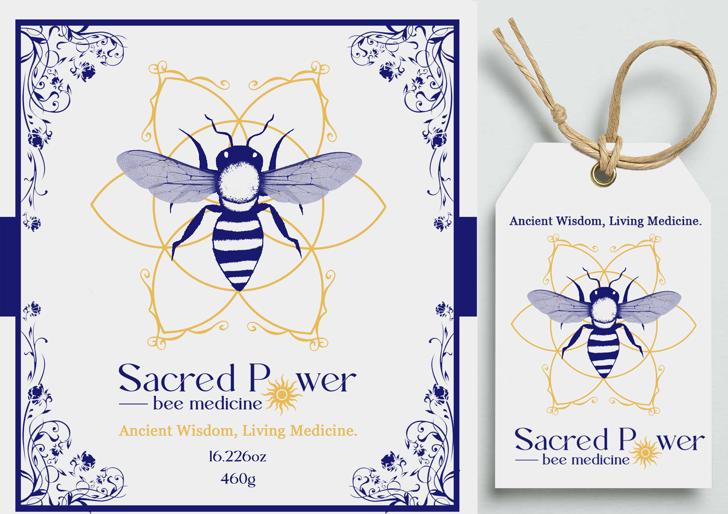
Sacred Power Bee Medicine: Logo & Packaging Development
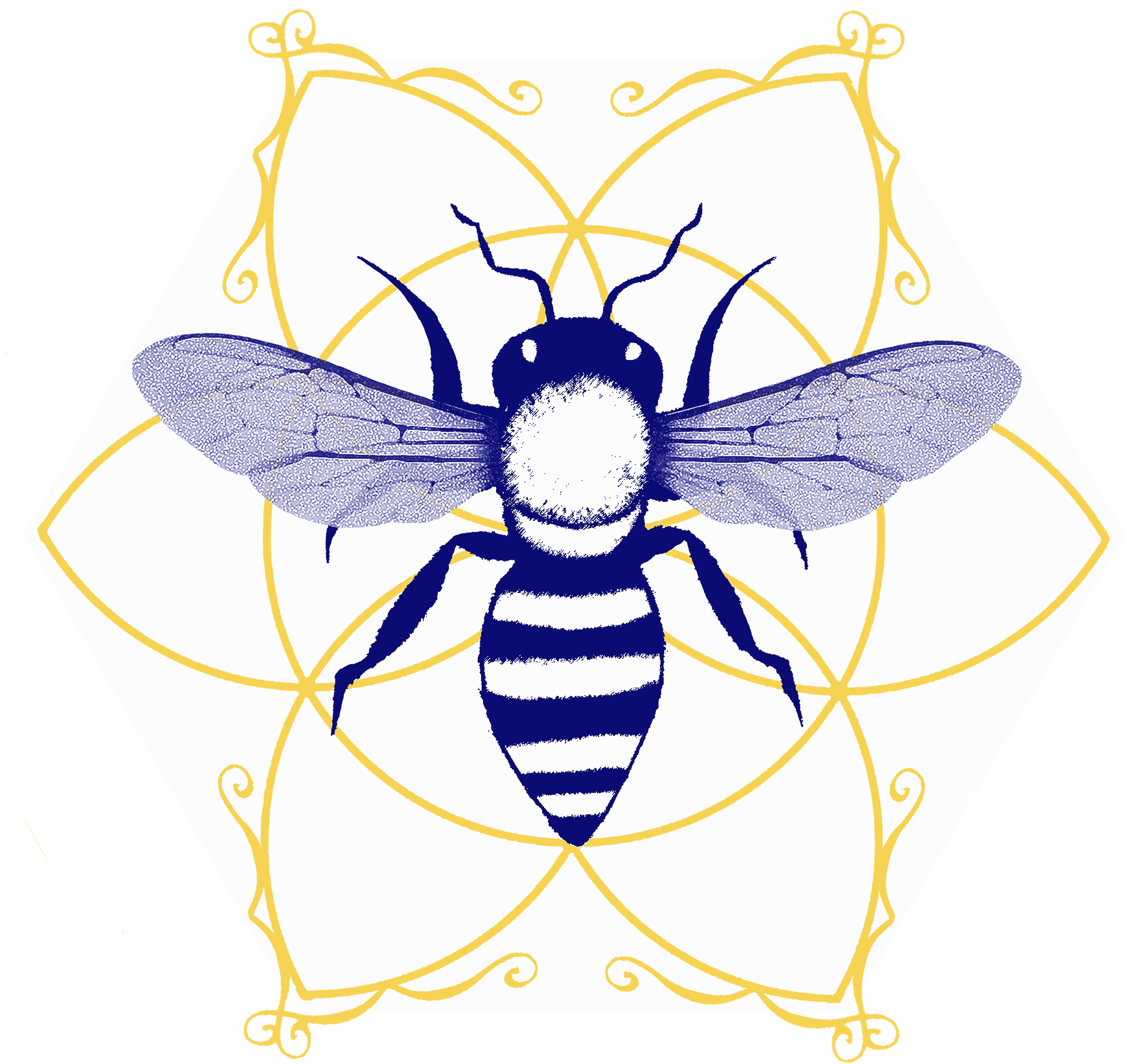
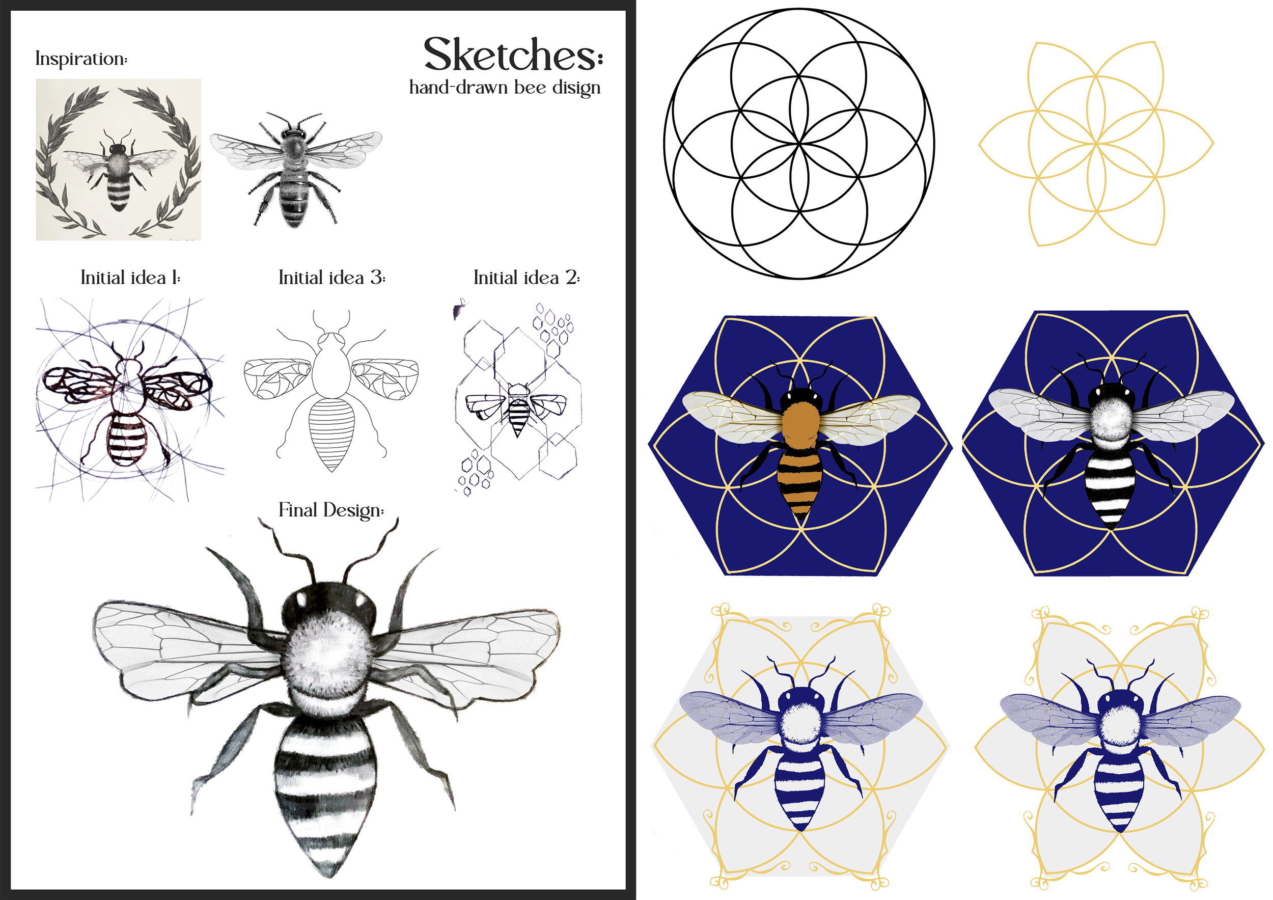
The logo for this locally produced honey from Byron Bay was developed through a considered and collaborative brand exploration process. Working closely with the producer, we defined a visual identity that authentically reflected the integrity and character of the honey itself.
Because the product is raw and organic, it was essential that the logo embodied that same sense of purity and natural authenticity. The identity needed to feel honest and grounded, while still holding a strong and memorable presence.
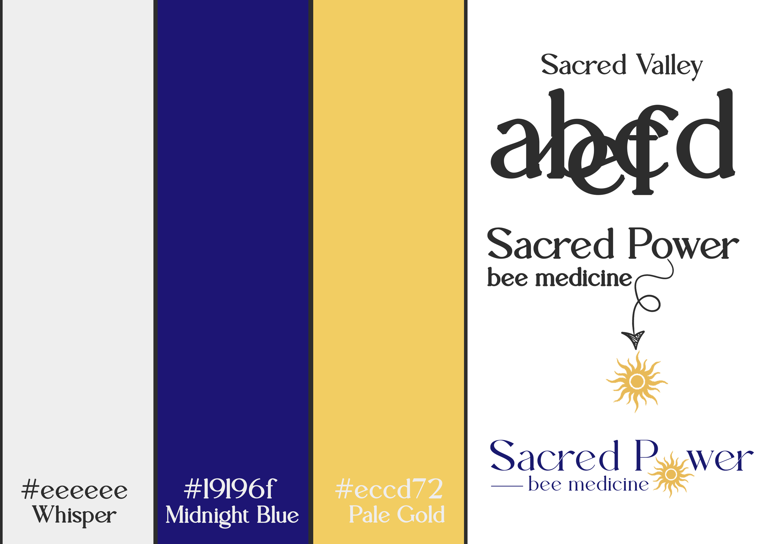
The chosen colour palette was inspired by the symbolism of the queen bee — representing royalty, strength, and sacredness. Deep, rich tones were selected to communicate power and reverence, elevating the brand beyond a simple local honey product and positioning it as something both premium and meaningful.