Heart of Leadership: Logo Designs
Tonga Retreat
I was commissioned to design a logo for Heart of Leadership, a global company delivering immersive leadership transformation experiences. This identity was created specifically for their executive retreat in Tonga, where CEOs swim with whales as part of a transformative journey.
The logo was designed to capture the essence of the retreat without explanatory text — integrating Tonga and the symbolism of whales to create a mark that feels powerful, meaningful, and rooted in connection.
Colour & Typography
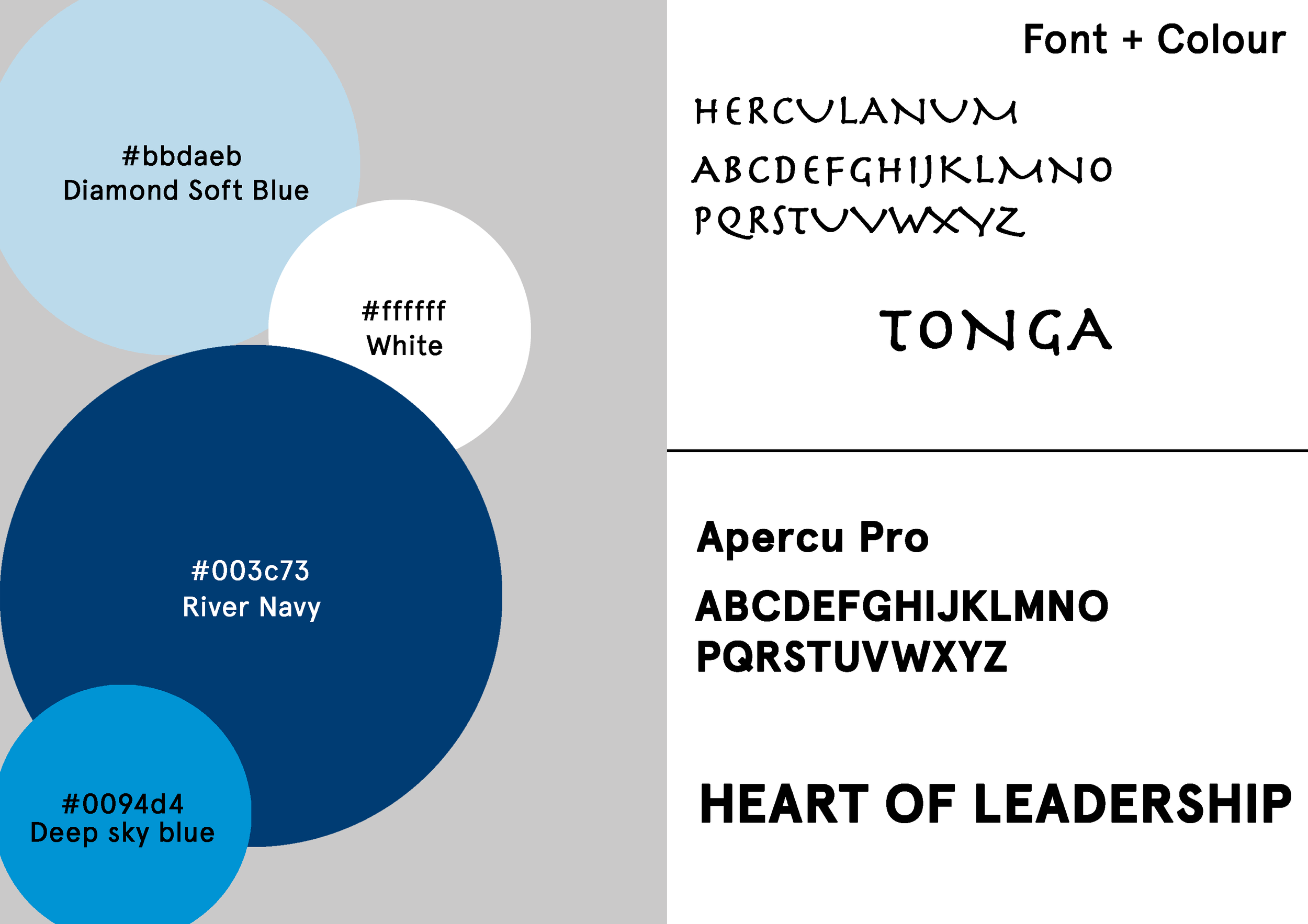
The colour palette features a range of blues to evoke the ocean, whales, nature, and a sense of calm. White was used for the whale to create clarity and impact, while black provides strong contrast in both the outline and typography.
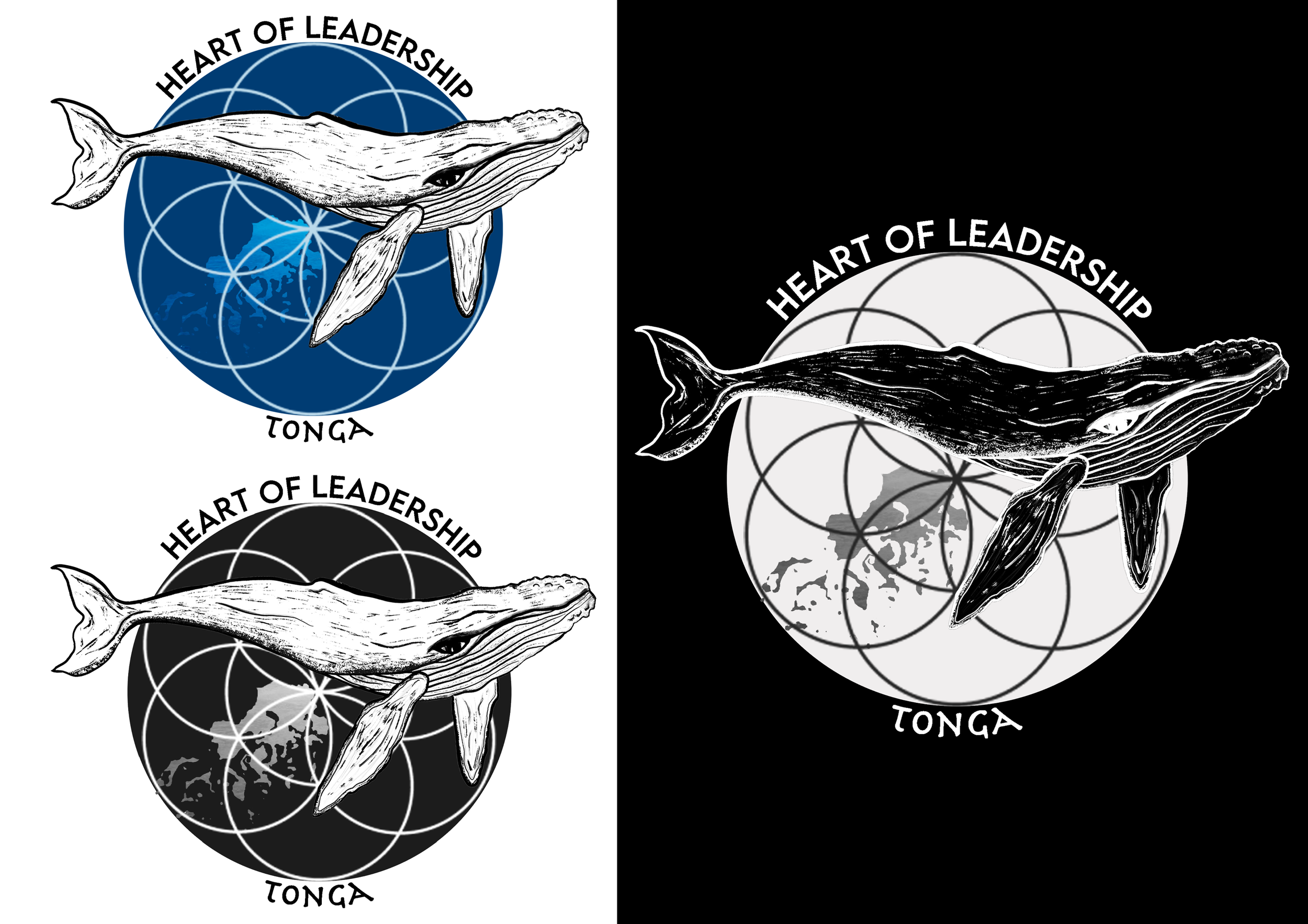
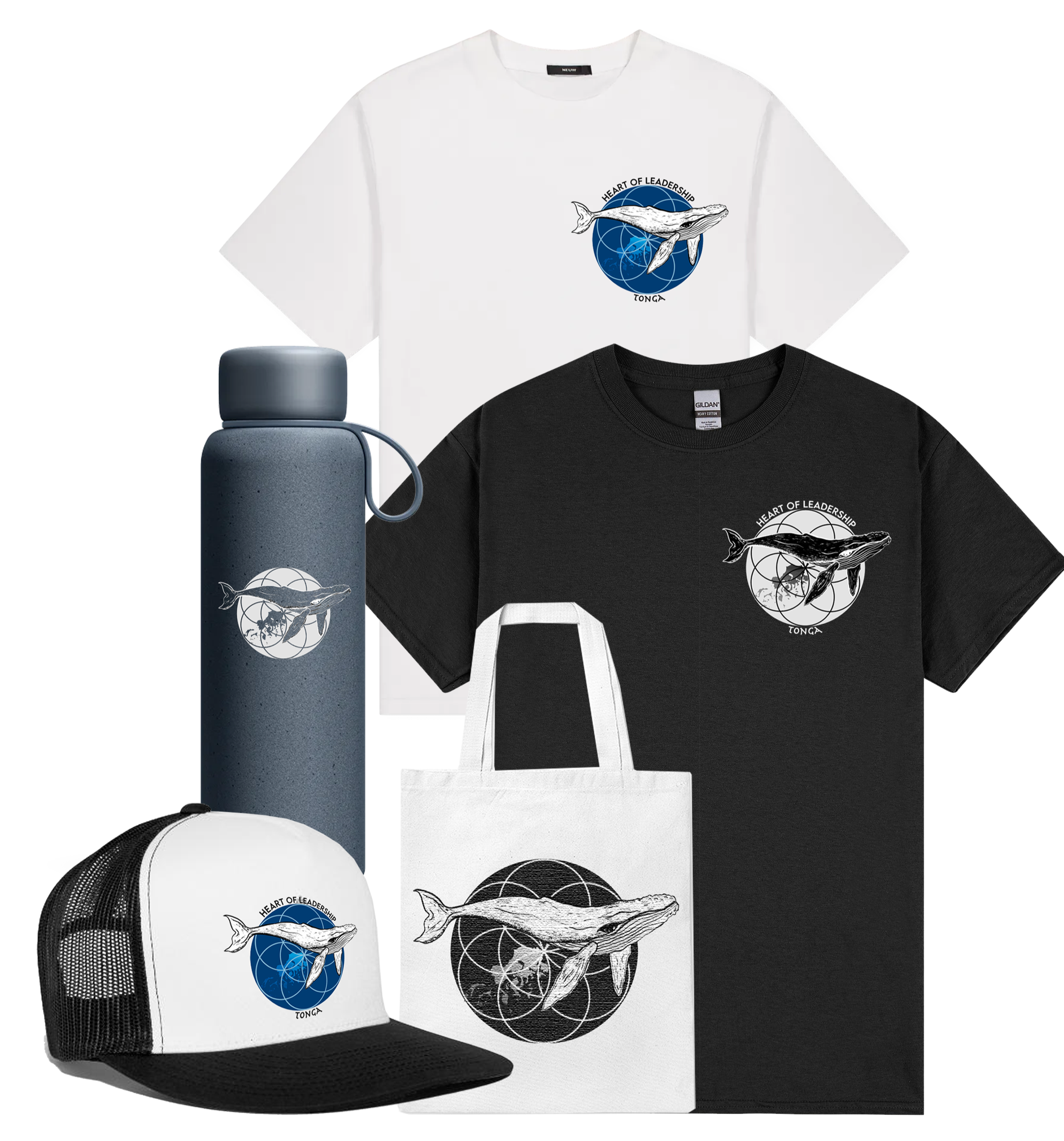
To ensure versatility across applications, I developed both a standard black-and-white version and an inverted variation for engraved merchandise, such as water bottles.
For the word 'Tonga,' I selected 'Herculaneum.' Its organic, almost tribal character felt aligned with the island setting and the spirit of the retreat — where leaders come together as a collective, forming deeper connections with their teams and themselves.
Logo Imagery
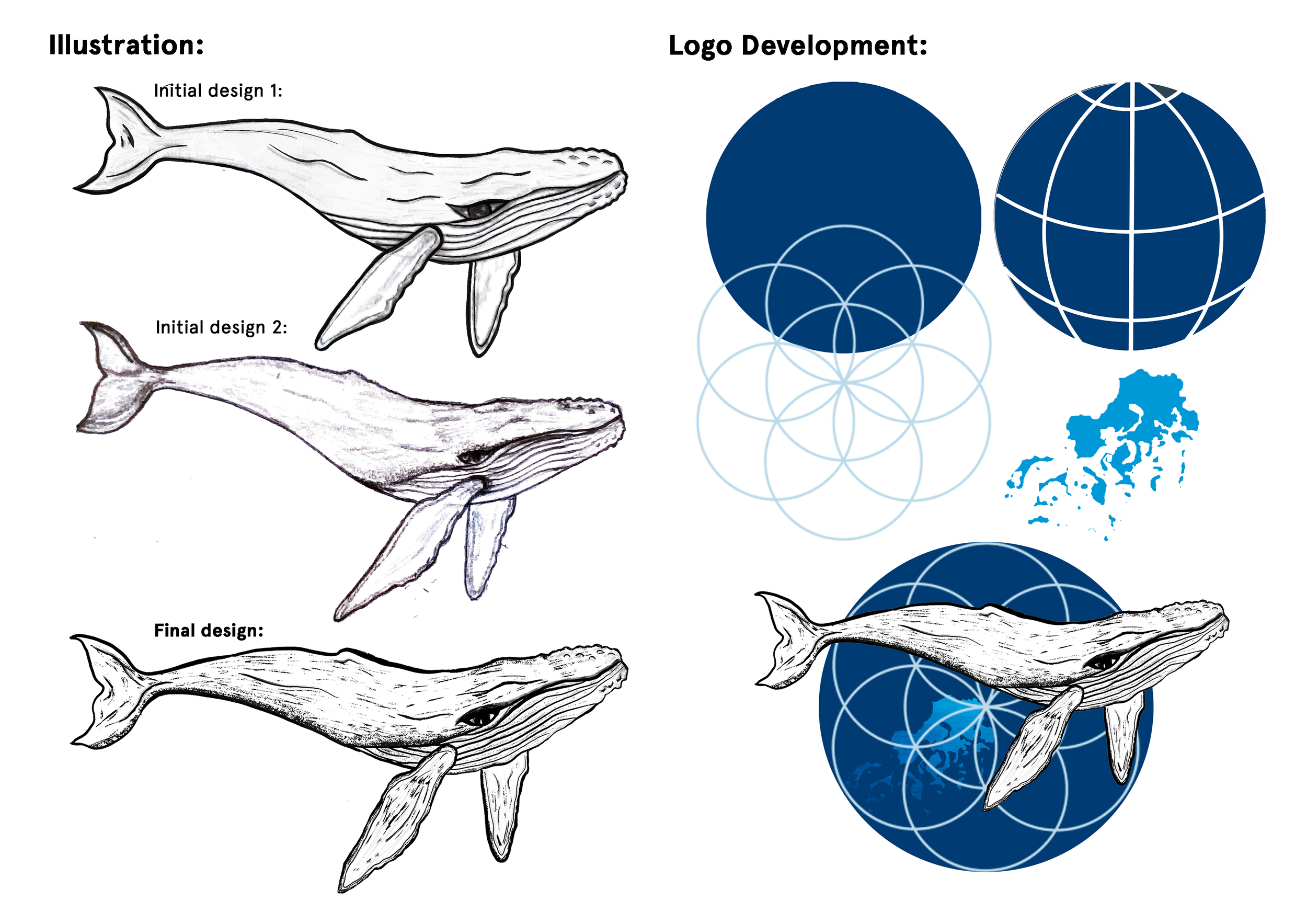
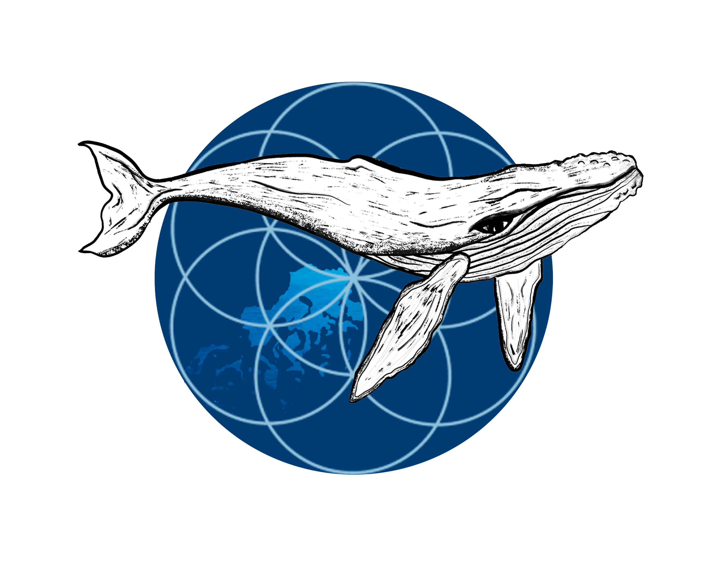
At the core of the design is the Seed of Life, a sacred geometry symbol representing the seven days of creation — reflecting the structure of the retreat. It also symbolises origin, balance, and interconnectedness, aligning with the retreat’s purpose: supporting individual growth, fostering balance in leadership, and strengthening connections among leaders, their teams, and themselves.
A circular globe motif surrounds the symbol, featuring a map of Tonga to ground the identity in its location and reinforce its global perspective.
To contrast the geometric precision, I hand-sketched a whale in a raw, organic style. This approach reflects the authenticity of the experience and the powerful presence of nature — the true host of the retreat.
A journey into the heart of who you came here to be…
Japan Retreat
For my next commission with Heart of Leadership, I was tasked with designing a logo for their leadership retreat in Japan. This experience invited executives to step into a new environment — skiing in the mountains of Japan — as a catalyst for growth, resilience, and perspective.
The logo needed to clearly reflect the location while embodying Japan's strength and bold visual identity. Through carefully considered colour and imagery, the mark captures both the energy of the landscape and the transformative nature of the retreat.
Colour & Imagery
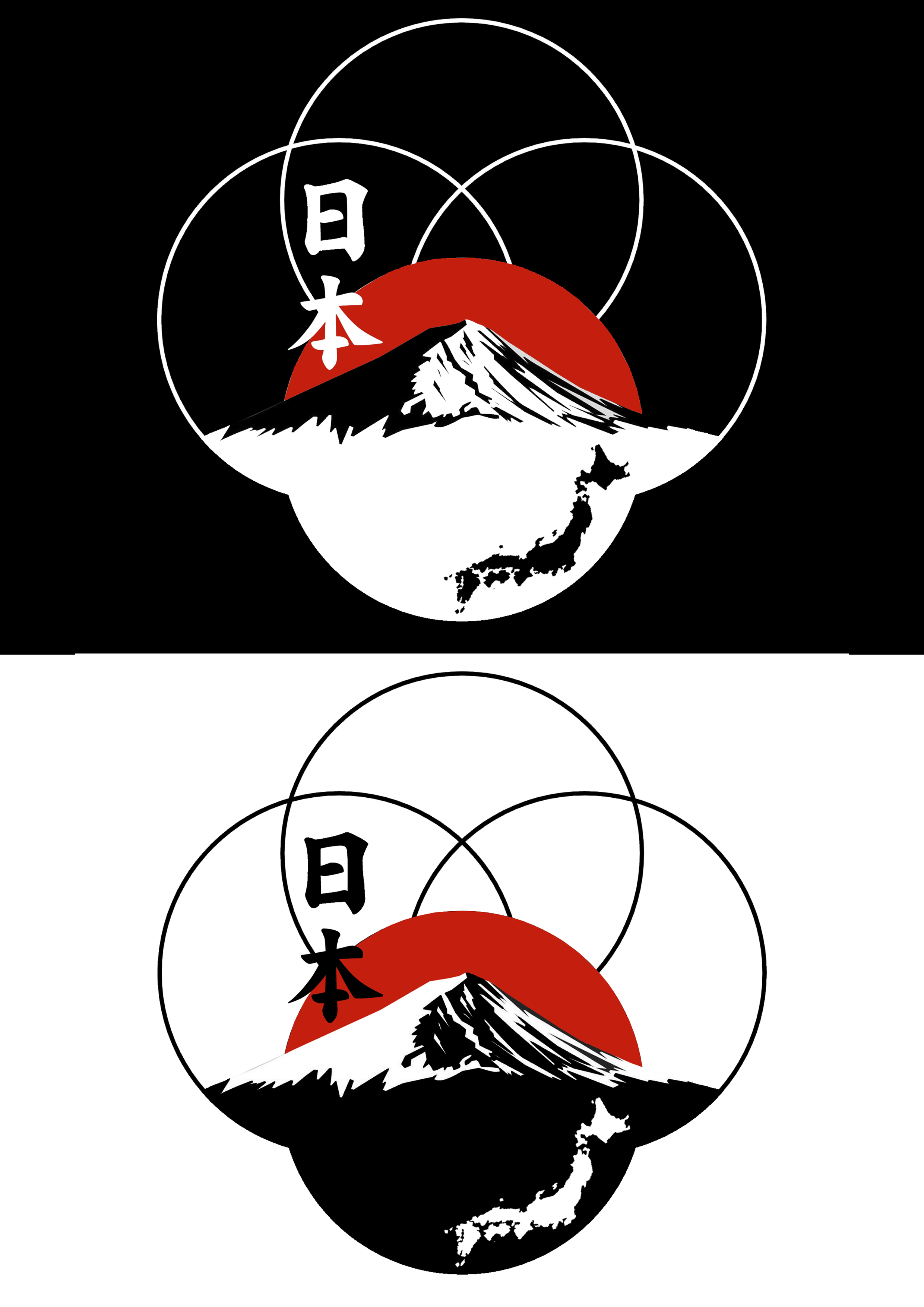
The colour palette draws on Japan’s iconic national colours — red, white, and black — creating an immediate, recognisable connection to Japan. Together, these tones convey strength, clarity, and boldness, ensuring the mark feels both powerful and memorable.
To maintain continuity within the retreat series, I revisited the Seed of Life symbol used in the Tonga identity, extracting and refining a different segment to create distinction while preserving conceptual alignment with the wider brand. This geometry continues to represent unity, growth, and interconnected leadership.
A red sun positioned behind the mountain references traditional Japanese visual culture and subtly echoes the national flag. The snow-capped peak represents the alpine landscape where the retreat takes place. At the same time, an abstract map of Japan is embedded within the mountain form — integrating location directly into the composition.
The word “Japan” is written in Japanese script, reinforcing authenticity and a sense of place. Even for those unable to read the characters, its placement within the design makes its meaning immediately understood.